Guide
Wedding uplighting colours: what works in a real room
A colour on a mood board and the same colour on a banquet-hall wall are different colours. Here is how to choose one that survives the transition.
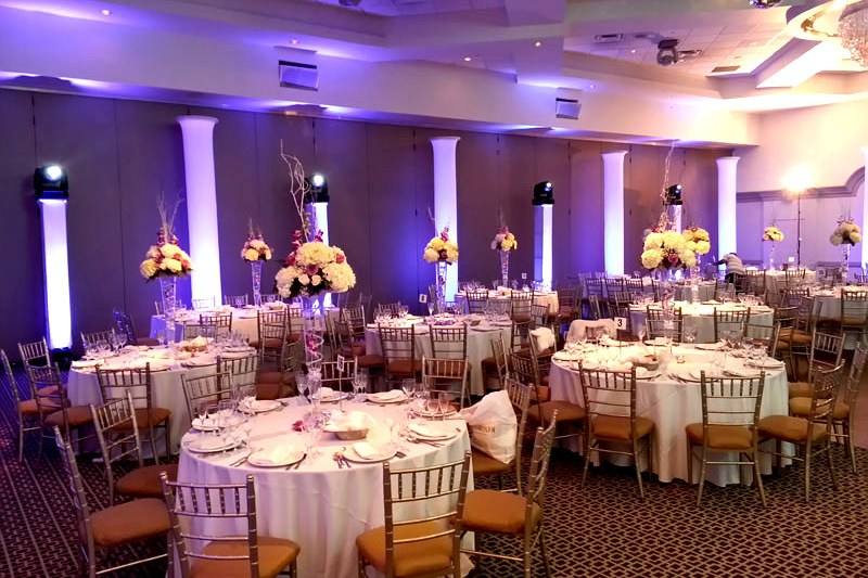

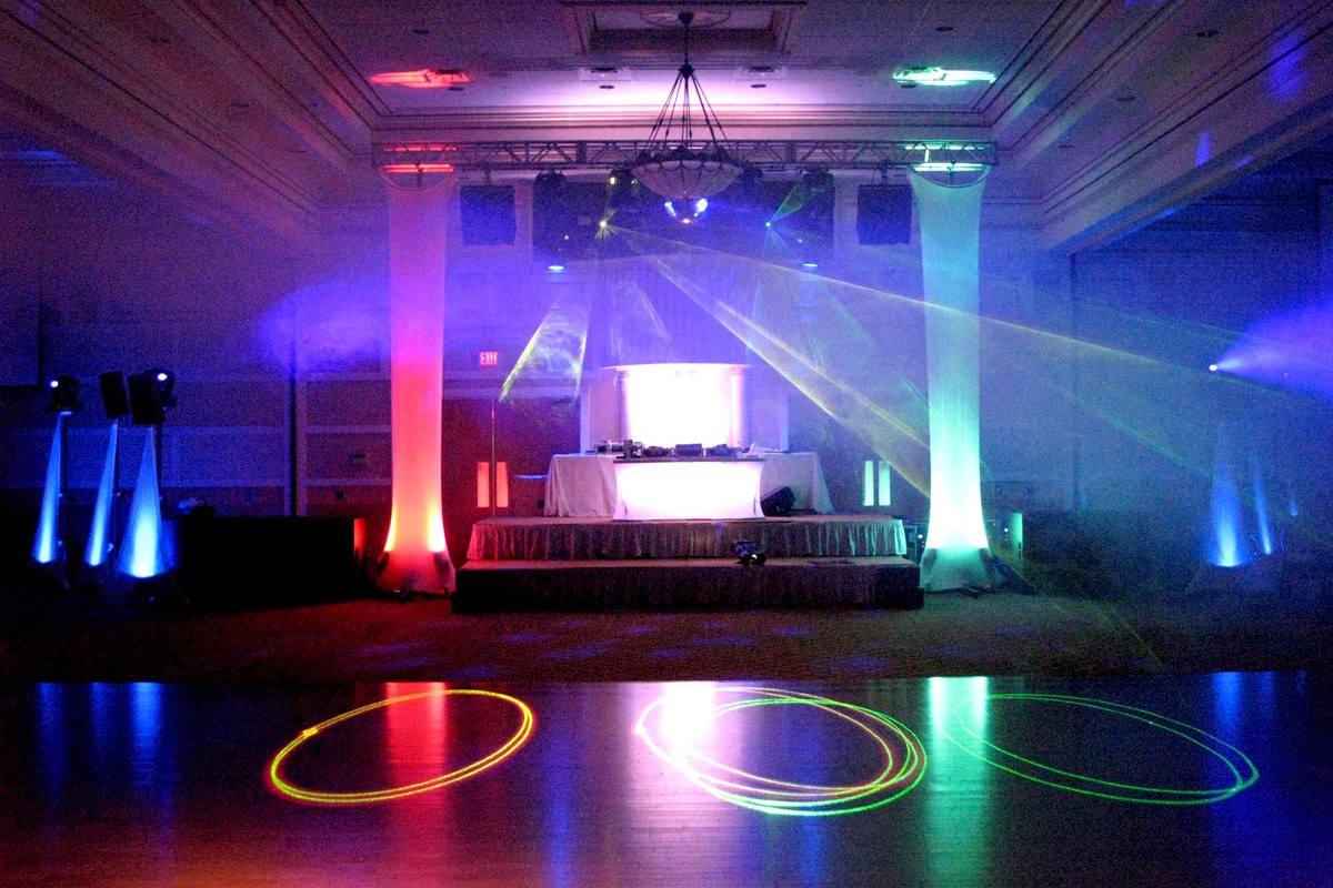
The one thing to understand
Uplighting is coloured light landing on a surface that already has a colour. What you see is the product of the two, not the light on its own. A cream wall subtracts blue; a beige-pink wall subtracts green. This is why the amber that looked warm in the showroom looks muddy in your hall, and it is entirely predictable once you know the wall.
So the first question is never "what colour do we want". It is "what colour is the wall". Ask the venue, or send us a daylight photograph of the room empty.
What works, by wall colour
| Wall | Excellent | Avoid |
|---|---|---|
| Cream / ivory | Amber, warm white, blush, deep purple, teal | Pale yellow (disappears), lime |
| Beige / tan | Amber, deep red, royal blue, magenta | Pale pink (turns grey), pale green |
| White | Almost anything. This is the easy case | Very pale tints: no visible effect |
| Grey | Cool blues, magenta, teal, cold white | Amber (turns brown), warm pastels |
| Wood panelling | Amber, deep red, warm white | Blue and green (fight the wood badly) |
| Mirrored / glass | Anything, but aim carefully | Direct-on beams. They bounce into guests' eyes |
Colours that reliably work
- Amber and warm white. The safest good choice in the city. Makes almost any room look expensive and flatters skin tones in photographs.
- Deep purple. Reads rich rather than loud, and it is the one saturated colour that photographs well.
- Blush / soft pink. Beautiful on cream and white. Vanishes on beige.
- Royal blue. Dramatic, cool, and it makes a large room feel intimate, but it eats light, so you need more fixtures.
- Teal. Underused and very good on cream. Pairs with amber for a two-colour scheme that does not look like a nightclub.
Colours that mostly do not
- Pale yellow. Invisible on anything but pure white.
- Green. Notoriously unflattering on skin. Fine on a feature wall behind the band, wrong on the perimeter where your guests are standing.
- Red at full saturation. Reads as a fire exit. Deep red at 60% is a completely different and much better thing.
- More than two colours. Two is a scheme. Three is a mistake. Four is a bowling alley.
Matching your decor colour
Do not try to match exactly. Light and fabric are different media and an exact match will read wrong because the sheen differs. Aim for the same family a shade deeper. If the bridesmaids are dusty rose, uplight in a slightly deeper rose and the room reads coordinated rather than matchy.
Send us a physical swatch or a hex value and we will set it in the actual room on the day, with the house lights at their real level. That is included in every uplighting booking. See also event lighting for the rest of the rig.
How many fixtures
| Room | Fixtures | Spacing |
|---|---|---|
| Small hall, up to 120 guests | 20 | Every 8–10 ft on the perimeter |
| Typical banquet, 200 guests | 30 | Every 8 ft, plus 4 on features |
| Large room, 300+ | 40 | Every 6–8 ft; deep colours need more |
Deeper colours need tighter spacing because they carry less light. Twenty blue fixtures in a room that would take twenty ambers will look patchy.
Common questions
What is the best uplighting colour for a wedding?
Amber or warm white is the safest strong choice. It flatters skin in photographs and works on almost every wall. Deep purple and teal are the best saturated options.
Can uplighting match my exact wedding colour?
Close, but do not aim for exact. Light and fabric read differently. A shade deeper in the same family looks coordinated; an exact match looks off.
How many uplights do I need?
Roughly one every 8 feet of perimeter: 20 for a small hall, 30 for a typical 200-guest room, 40 for a large one. Deep colours need tighter spacing.
Does uplighting colour affect the photographs?
Considerably. Green and heavily saturated red are unflattering on skin. Amber, warm white and deep purple photograph well. Tell your photographer the colour in advance.
Can we change colours during the night?
Yes, and it is a good idea: warm white for dinner, your accent colour for the reception. It is included when we are running the lighting.